


Inspired by Pantone: 12 Easy Ways to Add Colour to Your Home Interior
The Spring/Summer 2019 Pantone colours, inspired by New York Fashion Week, are a powerhouse palette ideal for sprucing up your space. Whether you’re passionate about DIY projects, live to decorate your home or want to stay up to date on the latest trends, this year’s tones will not disappoint.
Read on to learn how to incorporate colour into you home in 12 simple ways, using Pantone’s picks of the season to guide your design choices.
Layer Colour-on-Colour with Fiesta
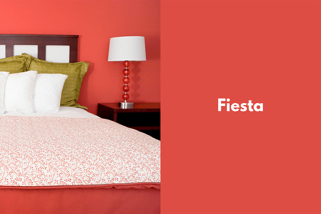
Bold and beautiful like a summer sunset, Pantone’s Fiesta is perfect for creating a vibrant space. A stunning paint colour for a bedroom, or ideal for a feature wall behind the bed, create a vivacious colour scheme by adding accessories and lighting fixtures in the same tones. For instance, integrate reading lamps, bed frames or throw blankets in similar bright tones throughout the room.
If you believe the devil is in the details, add a hint of Fiesta in bedside table knobs or by painting your room’s molding.
Paint a Feature Wall with Jester Red
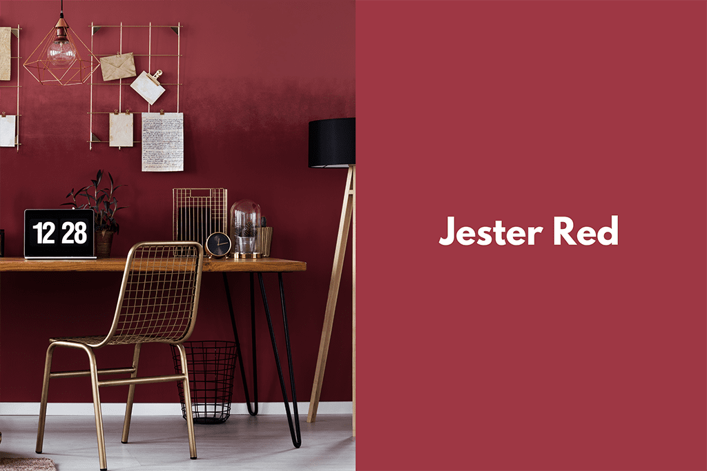
Deep and delicious like a freshly picked plumb, Jester Red draws the eye and creates elegance when used as a feature wall. An ideal choice to draw focus to your office desk, complement this rich jewel tone by adding metal accessories like file folder racks, chairs or table top planters.
Spice Up Your Kitchen with Turmeric
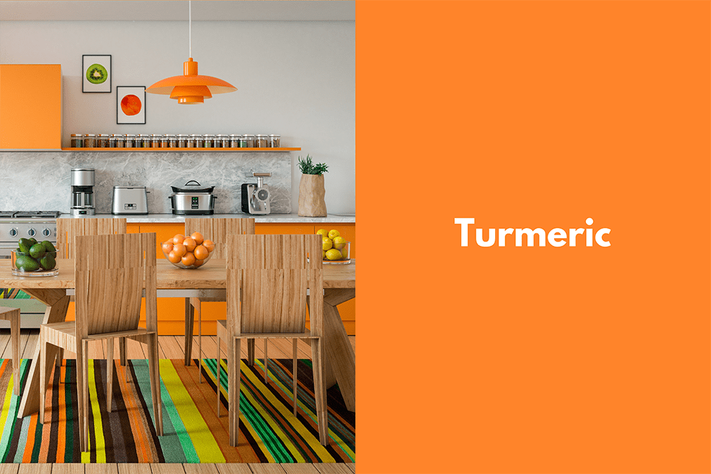
A heart-warming paint colour for a kitchen, don’t be afraid to think outside the DIY box. Try painting your cupboards an eye-popping hue, leaving walls a gentle neutral. Accessorize with fruit bowls, salt and pepper shakers or teapots in cool tones to juxtapose energetic Turmeric.
Not ready to fully commit to cabinets? Try placemats or tea towels in a bright shade.
Let Living Coral Brighten Your Bedroom
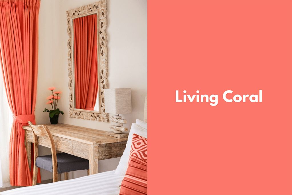
Sweeten up your space by with curtains in Living Coral. To bring the aesthetic together, consider adding patterned pillows and opting for light furniture—such as side tables, sofa tables and coffee tables—to brighten up the room.
Did you know that Living Coral is also the Colour of the Year? Learn about it here: pantone.com.
Flaunt Pink Peacock in Your Accessories
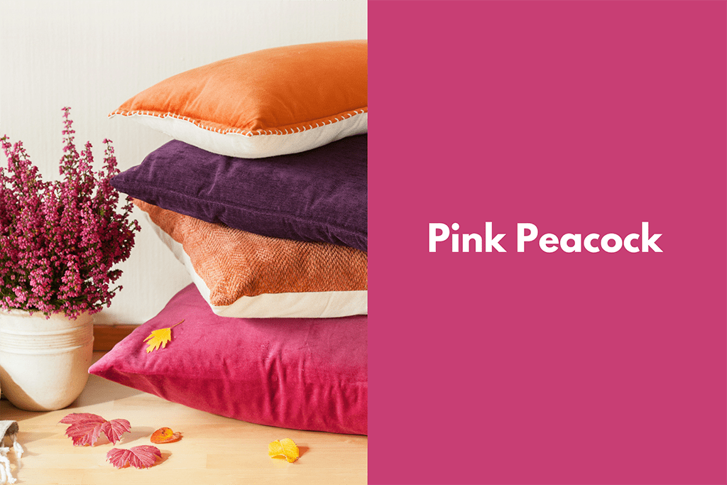
Perfect for adding a pop of Pink Peacock, buy or sew throw-pillow covers in this bold tone. Matching your floral arrangements adds a luxurious touch while diversifying the textures in your home.
Additional ways to layer in colour throughout your home’s interior is to look for coasters, candle votives, book-ends or centerpiece bowls in similar tones. Accessorizing in splashes of colour is an easy way to spruce up your space’s aesthetic in an easy way that will last for years but can also be changed with minimal effort.
Complement Neutrals with Pepper Stem
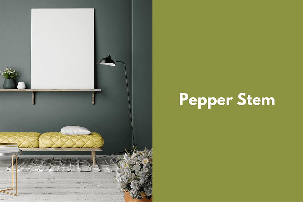
If stately grey and warm taupe is to your liking, elevate your interior’s sophistication with a touch of Pepper Stem. Adding a footstool, bench or coloured shelving is an easy to incorporate this composed colour into your neutral aesthetic.
Pepper Stem is also a unique shade to paint a nursery or toy room as a spin on a classic neutral. This gentle colour is calming and fresh—making it a fun canvas for your little one’s mobiles, crib, teddies and storage baskets.
Bring Aspen Gold’s Sunshine Tones to Your Patio
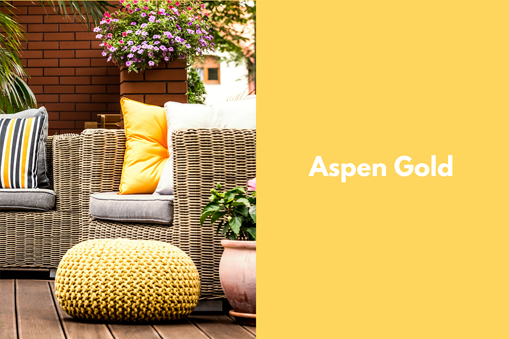
Ensure your outdoor space is warm and bright, even on days when the sun does not shine, with colours like Aspen Gold. Ideal opportunities to incorporate this lovely yellow include seat cushions, wicker ottomans, storage chests, umbrellas or even patio glassware.
Feel Like Royalty with Princess Blue
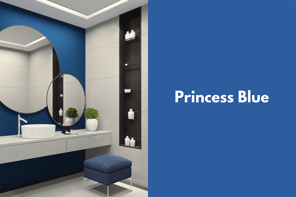
Why not bring this regal blue into your bathroom? Draw focus to your vanity by painting the wall this striking colour or add accessories such as towels, bathmats and toothbrush holders for a subtle elegance.
Upholster Your Furniture in Toffee
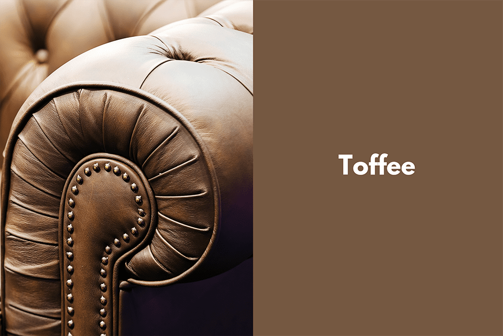
Warm, delicious colours like Toffee add sweetness and depth to your space. Give the furniture you have a second lease on life by upholstering it in fabrics of this sumptuous tone.
Another way to bring cozy colours like Toffee into your space is through a woven rug in similar shades beneath a coffee or dining room table.
Make Your Headboard Fabulous with Mango Mojito
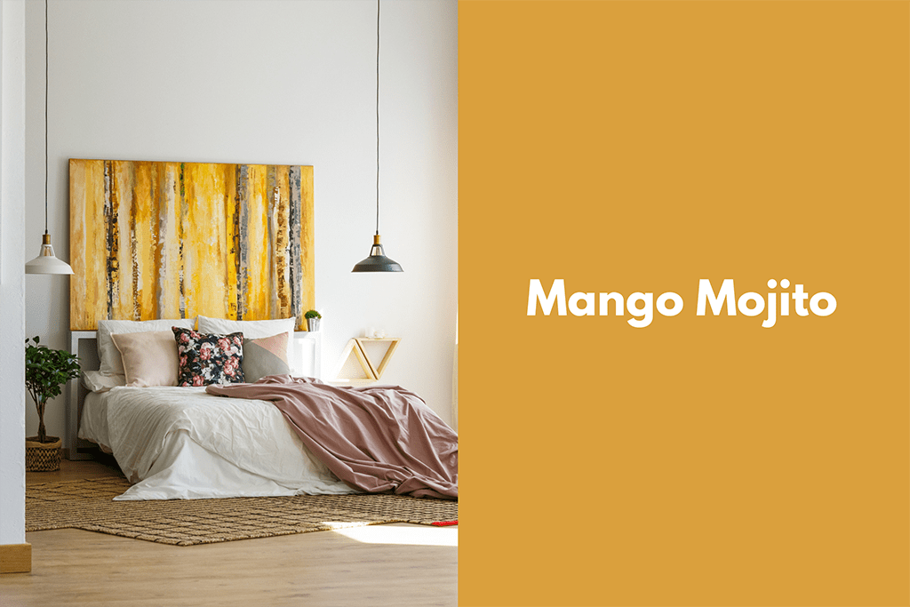
This delectable colour transports one to tropical climes. Bring a little Mango Mojito into your bedroom by updating your headboard with a new coat of paint or switching up the fabric. Choose to make a bright colour the focus point with the headboard alone or bring a chic shade throughout your space with matching shelving.
Stand-Out from the Crowd with Eclipse

The perfect hue to paint your front door, Eclipse is an example of how to create a dignified curb appeal with a touch of mystery.
Go one step further and match your garage door to your home’s entry way by painting it in this elegant colour or add a touch of midnight blue with a welcome mat.
Match Your Wood with Brown Granite
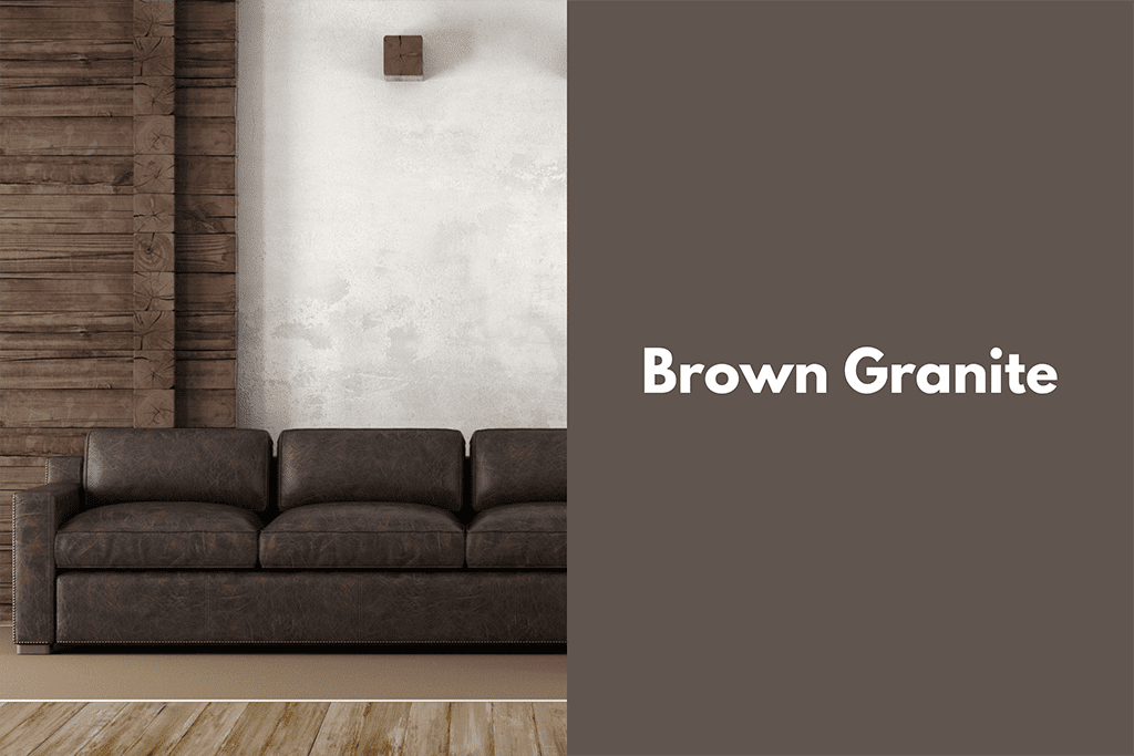
Get creative by staining wood floors or a feature wall in this modern neutral. Bring the look full circle with leather sofas, side chairs and love seats in similar tones to Brown Granite. One way to bring muted colours to your walls is through frames, valances and sconces.
Inspired by the Spring/Summer 2019 Pantone palette and feeling the home renovation itch? Check out our blog for more insightful tips.